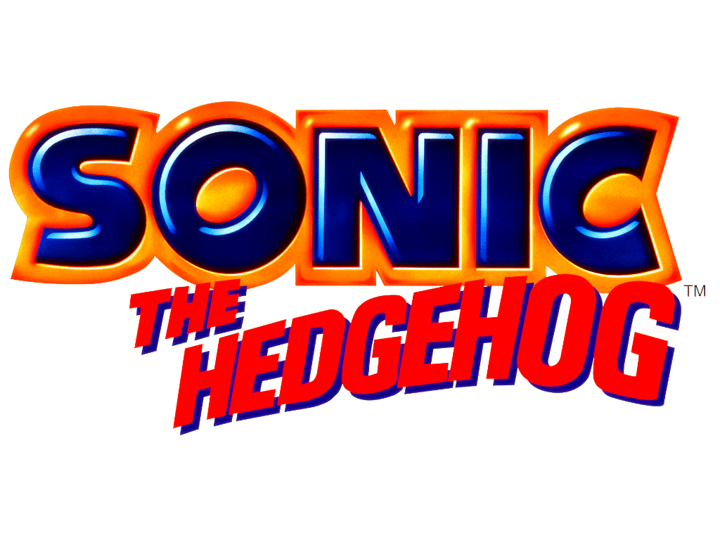
In Learning Outcome 2 and practically my Graphic Narrative, I felt my drawings and the narrative were of a good standard but there is perhaps some confusion in terms of the text and typography used, which is why I am writing this small passage to explain the reasoning behind why some of typography I research did not make the final production.
I managed to get the Sonic The Hedgehog, classic font which I was very pleased with and I felt that was essential consider the comic was about Sonic The Hedgehog become obsese and was more based on the classic design of Sonic from years past so it made sense to use the typography/logo of Sonic from the 90's.
The explanation for The Simpsons typography is quite simple. As a way to play with the original Sonic logo for the first scene of my comic, I was going to incorporate food into the design, this would mean have the O shaped as a doughnut, the I as a bar of chocolate, the S and three jelly snakes joint together and so forth and I got inspiration from this by looking into the typography of the Simpsons Movie logo as it has the O shaped as a donut with a small bite in it and I felt that was very effective and could provide a bit more insight into my comic along give it a comedic touch but sadly I had to concentrate on the story elements of the comic and I felt that it was completely essential, it would have been something neat to include at the time but I wasn't particular fused but I still feel it was something of importance to research as not only was it different typography than the Sonic logo but it gave inspiration to an idea that I didn't end up implementing due to time constraits.
As for handwriting and most of the text in the comic, I wanted to keep it bold and in my hand writing as I felt that would make it a lot more personal. I didn't feel there was a need to research other peoples hand writing as I was going to use my mine and that would be a very unique type of typography. I felt that using my hand writing set it apart from otheres and right away from starting to develop the product to actually finishing and having a final production, I wanted to use my handwriting in pencil all the way through, just like the drawings and not have it digitally composed since I felt that, not only does it make it more personal but I just didn't have the inspiration or time, nor the skills to undergo colouring and digitally remastering every scene in the comic book with a pen on programs such as Adobe Photoshop CS5 for example. It wasn't my intention in the first place and I felt I achieved that by keeping the hand writing style, something that I can say is mine and as for the occasional bold and underlined words, those are primarily for dramatic effect and secondly for to keep the reader interested and excited with the slight chance in the text styles.


No comments:
Post a Comment