Wednesday, 28 March 2012

Graphic Narrative Evaluation [LO3]

GRAPHIC NARRATIVE
Learning Outcome 3

Evaluation

This evaluation will looking into the Narrative Structure, Image Construction, Historical and Cultural Context and Production Processes of my comic and critically analyses them.
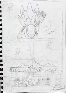
When it came to my Narrative Structure I felt it went very well with it being pretty linear and single strand. It was pretty much a journey, following Eggman as Sonic, travelling through various locations before meeting him face to face for the final conflict and climax as Eggman and Sonic meet face to face a total of three times in the comic.

However what I also felt went well was that even though the Narrative Structure was lined, it could still have open and multi-strand vibes as Sonic does say at the end “Time for Another Adventure” and it does say Episode #1: Changes as a subtle so that could allow for some openings for other narratives but there is a resolution and a teaching moral to be said at the end of the comic which Sonic addresses directly.


The only elements I felt didn’t go so well with the Narrative Structure was that motivations aren’t entirely clear as we understand Eggman transforms the properties to the rings that Sonic absorbs to make him fat but we don’t know what Eggman is doing at a space station as he is rudely interrupted by Sonic which was works quite well but can make some of the motivations unclear and cause an enigma of sorts.

With the Image Construction I felt that the form and shape was nice. The environments looked like they were stripped out of the game a lot of the time and I felt the line and tone was very detailed and kept true to the source material. The representation is mainly towards a younger audience but can still be enjoyed by an older audience which I really enjoy.

I would’ve liked colour to be incorporated in order to make the comic appear more lively and interesting but to compensate for that I decided to add tone to some of the drawings. I felt the captions were suitable and related to the characters already established personalities but I would’ve enjoyed some of the images to be more consistent as sometimes Sonic appears slim when he should be fat but I would argue the signification of that was due to Sonic travelling so far and avoiding rings on purpose, he loses weight and the transformation to Super Sonic using the Chaos Emeralds allows him to restore to his original self.


Historical and Cultural Context was something I felt went exceptionally well. There are a lot of references to the source material with direct captions to the games, characters, movements and generally the pop culture surrounding the Sonic The Hedgehog Franchise. Cultural context was something I focused on quite a lot and if you’re a fan of the series you’ll find various nods here and there to the Sonic fan base and society that will make sense to them however the historical context wasn’t something that I felt didn’t go so well. There is a mixture of old themes and character designs with the more modern designs which you’ll notice mostly with Sonic himself but in a way this was intentional in order to make it appealing and more exciting for general readers but something both fans of the old and new can appreciate.

The Production Processes included me going against time management which I didn’t feel went well as that isn’t typically one of my strong suits but I felt my creative abilities shined and was more evident than it has been in my other units and projects of the courses. I responded well to feedback and even incorporated ideas from my peers or readers of the comic as it progressed that I had adapted and felt worked well.

As a whole I really enjoyed making this comic and I felt it went very well, the story is exciting, the designs are great and have strong elements from the culture and source material, I just wish I managed my time more well and if I was to do this again, I would’ve improved drawings and added colour but it was a fun project regardless.


Words: 699

Thursday, 12 January 2012

Budget & Equipment Sheet [LO1 - Task 5] *

* = To be Updated

Cost and Legal Issues [LO1 - Task #4]

Research into Publication [LO1 - Task #3]

For my Graphic Narrative, I have decided to not create it for book, magazine or any other physical publication but instead a comic that is intended for viewing on the interent on a webpage. The reason is that whilst having the physical aspect is nice to have, being able to hold it, smell it and all this, I personally find it more enjoyable to read off a computer screen and since I will be drawing it, scanning it and inking it on the computer, it makes more sense to me to showcase the comic on the internet on a computer as well.

Websites such as DeviantArt and such give it's user the opportunities to upload their own comic creations and personally, when looking into DeviantArt and these similar sites, the comics is what I usually look into and I feel that's a good website to host such a thing. It also makes it easier to produce as whilst I will still be drawing the comic by hand, scanning it and inking it on computer, it's simply easier to ink on the computer and I will not have to scan it again to put it on a blogging site such as this, I could simply upload it or link the comic and that's that.

The easy accessiblity is something that appeals to me a lot and I understand that it's quite personal to have a comic in your hands and you get a bigger sense that someone produced this with traditional means but that is not something I'm not keen on as there is also the chance that the comic could be damaged by any means. It could be something as simple as spilling a drink or something more extreme like being burnt. Once it's gone, it's gone but on the internet, it's a lot more secure and I like that and whilst people might take the comic and put it on other sites without your permission, a least you can retrieve it back easier.

Character Logo Research [LO1 - Task #2]


Even though the characters in my Comic, Sonic The Hedgehog and Dr.Eggman, do not feature Character Logos on their clothing, incorporating the logos into the environment might be an interesting and suitable proposition as typically in the Sonic Franchise, Eggman Logo Designs and features of Eggman's body such as the small sunglasses and the long ginger mustache he has for his character design, are typically incorporated into the surroundings, whether that be machinery, doors or a theme park titled "Eggmanland", insert below:


As for Sonic The Hedgehog's logo, it is typically features into the Introduction and 
Outro of the franchise which might seem fitting but I would much rather have 
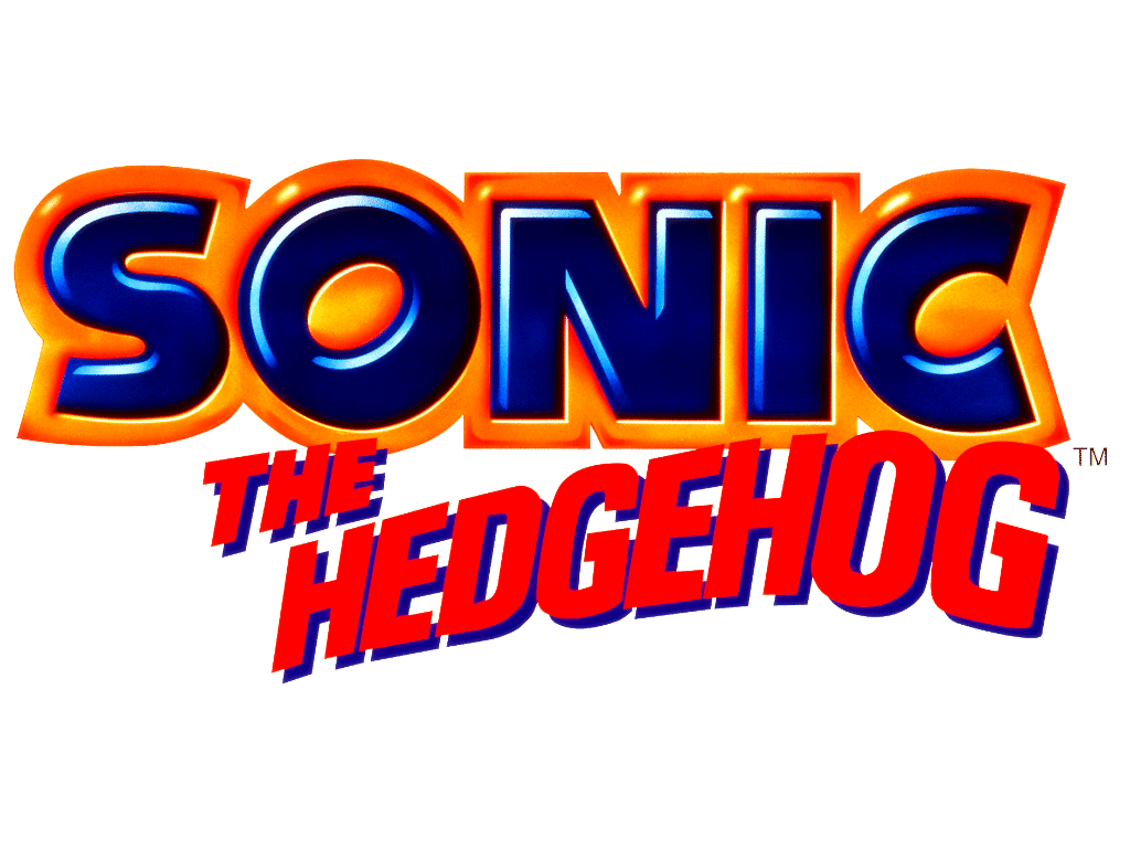
the "classic" Sonic The Hedgehog Title appear on the first page of my comic
rather than the official Logo for Sonic as, whilst it's not bad, I don't think
it would work as well with my comic as well as the title screen since I am taking inspirations from the older design more  often and this logo is based of the current, modern design of Sonic and whilst I am having that
design featured in my comic, it is not the main design and the insert below works better to me for those reasons alone: 


Typography Research [LO1 - Task #2]

When it came to the Typography of my Graphic Narrative Comic, it was very clear and apparent I wanted to use the Sonic The Hedgehog classic logo design from years past as whilst my comic will feature the modern, current design of Sonic, it will mostly be centering about the classic design but I want to incorporate both designs as this comic is catered to Sonic fans of the past and present and I feel incorporating both seems suitable but when it came to typography, I wanted to use the classic as the comic features classic Sonic more.


I am considering to insert it in the beginning and first scene as in introduction but I might look into putting character logos or some imagery for the first scene as I feel that is critical. The opening is very important, whether that be film or in a comic like this as it can hook the reader as with something like this, I want the title to look dramatic and interesting but as it stands, I feel I will use the traditional Sonic The Hedgehog title but with a twist..


Since my Graphic Narrative comic is titled Sonic The Fat Hedgehog, I instantly thought of food and when it came to typography Research and design it was never more clear to look into The Simpsons Movie title. Featuring a doughnut to represent the letter O in the title, it was a great idea and makes it stand out and when looking back at the word "SONIC" with it's bold, captialised lettering,  I began to think of ways of adapting the bold letters of SONIC into food and I couldn't help but think how great that was of an idea. It relates to the comic book's strengths, of Sonic being fat, it sounds fun and interesting and that is an idea I am going to put into my comic, with some examples being the letter I an already bitten chocolate bar, the letter C as a string of gummy worms and the letter S as a chocolate pastry. 


Wednesday, 11 January 2012

Explanation with Typography

In Learning Outcome 2 and practically my Graphic Narrative, I felt my drawings and the narrative were of a good standard but there is perhaps some confusion in terms of the text and typography used, which is why I am writing this small passage to explain the reasoning behind why some of typography I research did not make the final production.

I managed to get the Sonic The Hedgehog, classic font which I was very pleased with and I felt that was essential consider the comic was about Sonic The Hedgehog become obsese and was more based on the classic design of Sonic from years past so it made sense to use the typography/logo of Sonic from the 90's.


The explanation for The Simpsons typography is quite simple. As a way to play with the original Sonic logo for the first scene of my comic, I was going to incorporate food into the design, this would mean have the O shaped as a doughnut, the I as a bar of chocolate, the S and three jelly snakes joint together and so forth and I got inspiration from this by looking into the typography of the Simpsons Movie logo as it has the O shaped as a donut with a small bite in it and I felt that was very effective and could provide a bit more insight into my comic along give it a comedic touch but sadly I had to concentrate on the story elements of the comic and I felt that it was completely essential, it would have been something neat to include at the time but I wasn't particular fused but I still feel it was something of importance to research as not only was it different typography than the Sonic logo but it gave inspiration to an idea that I didn't end up implementing due to time constraits.


As for handwriting and most of the text in the comic, I wanted to keep it bold and in my hand writing as I felt that would make it a lot more personal. I didn't feel there was a need to research other peoples hand writing as I was going to use my mine and that would be a very unique type of typography. I felt that using my hand writing set it apart from otheres and right away from starting to develop the product to actually finishing and having a final production, I wanted to use my handwriting in pencil all the way through, just like the drawings and not have it digitally composed since I felt that, not only does it make it more personal but I just didn't have the inspiration or time, nor the skills to undergo colouring and digitally remastering every scene in the comic book with a pen on programs such as Adobe Photoshop CS5 for example. It wasn't my intention in the first place and I felt I achieved that by keeping the hand writing style, something that I can say is mine and as for the occasional bold and underlined words, those are primarily for dramatic effect and secondly for to keep the reader interested and excited with the slight chance in the text styles.

Script for Sonic The Fat Hedgehog [LO1 - Task #2] *

* = Needs Updated

Storyboard for Sonic The Fat Hedgehog [LO1 - Task #2]

Feedback from Ideas [LO1 - Task #1]

Idea #1 - Sonic The Fat Hedgehog   Votes 9
Idea #2 - Shadow                            Votes 5
Idea #3 - Revenga                            Votes 2

Idea #3 - Revenga

[Insert Logo Here]

Plot Summary:

Micheal is a typical school boy who wants nothing more than to have fun but with the teachers and his friends always on his case, he doesn't get much of a chance of what he truly wants to do to have fun and is only left playing with sticks in the dirt. After a few days of realising something must change, Micheal steps out of his bedroom window and plans out traps to make not only the teachers but his friends pay. It pays off and he is not cautioned as nobody would suspect such a small boy and realising such deeds, Micheal tries to get away with other dirty deeds and thus he does. He feels on top of the world but as he does more, he begins to find people are not noticing him and he feels that he is nothing more than a ghost. Micheal tries to think back and notices that he is living someone elses life and that he is nothing more than a small boy who has been captured for experimentation. It soon becomes a battle of whether Micheal can escape this imbodiment of a different small boy and how he can break away from this torment.


Sketches:

Idea #2 - Shadow

[Insert Logo Here]

Plot Summary:

Ryu Haiashaki is a trained, fully equiped ninja who has a strange dark past and has inhuman powers. A soul devouring entitiy known only as "Void" took over Ryu's body as a child and as he has grown up, his powers of shadows as not only made him a super human being but a nutcase. It isn't before long where Ryu cannot deal with real life and is deemed insane. During his time in asylum, he tries to fight the shadow within him before it completely takes over but it breaks him apart and Ryu manages to escape the asylum. He must now battle back and forth with the elements and find a way to control his shadow-like powers before he is killed. The shadows are only drained away his soul and it won't be long before he is left soul less and nothing more than a puppet but can Ryu succeed in controlling this strange, powerful entity?


Sketches:

Idea #1 - Sonic The Fat Hedgehog

[Insert Logo Here]

Plot Summary:

Sonic The Hedgehog, An Anthropomorphic Blue Hedgehog decides to go about his day in the world of Green Hill but it isn't before long that "mastermind" Dr Robotik, also known as Eggman decides to change the properties of Sonic's all beloved golden rings. The more Sonic collects throughout his adventures, the more he gains weight and before he can realise what is happenning to him due to his blistering speed, the small blue hedgehog goes from slightly podgey to massive. Now Sonic must find a way to change the properties of the rings, whilst avoiding them before Dr Robotik takes control of the island Mobius in which he will have the power to get over the world.

Sketches:

Mind Map [LO1 - Task #1]